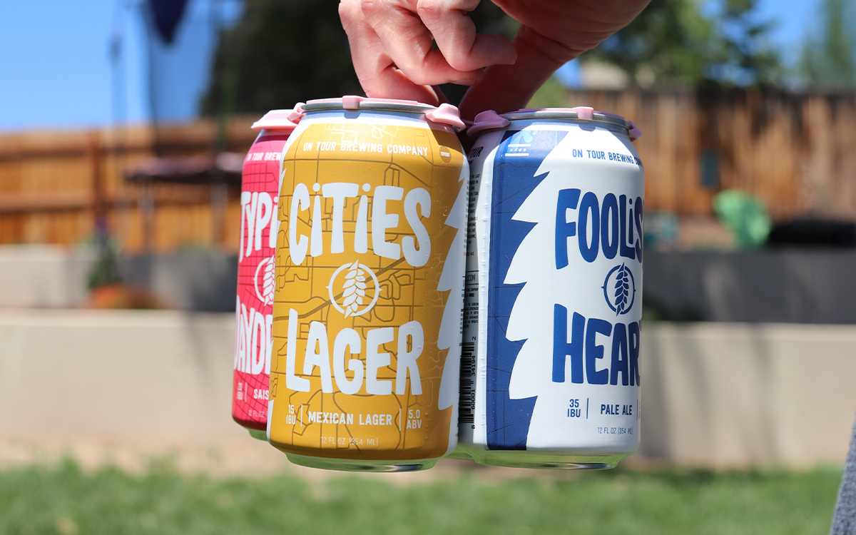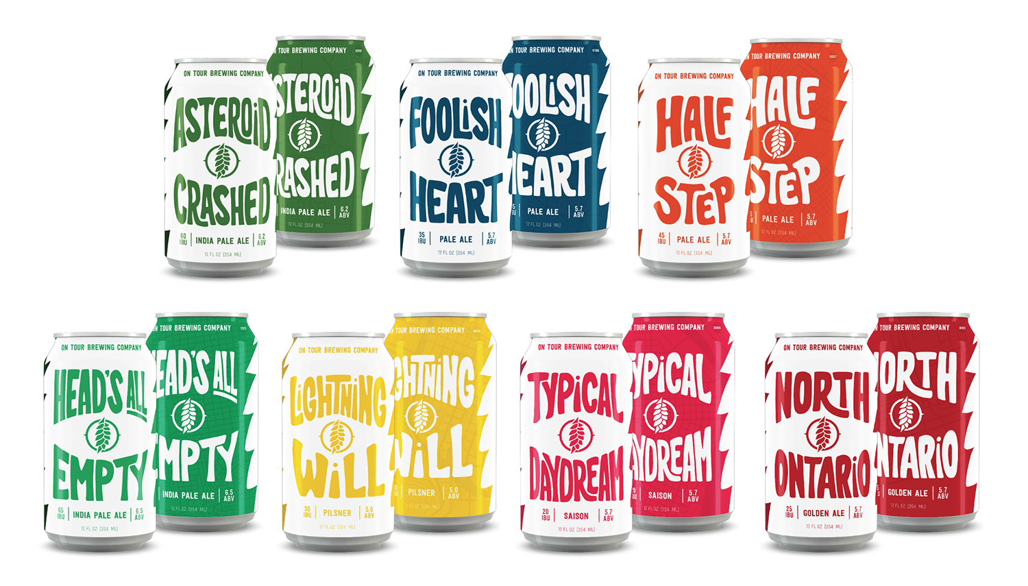
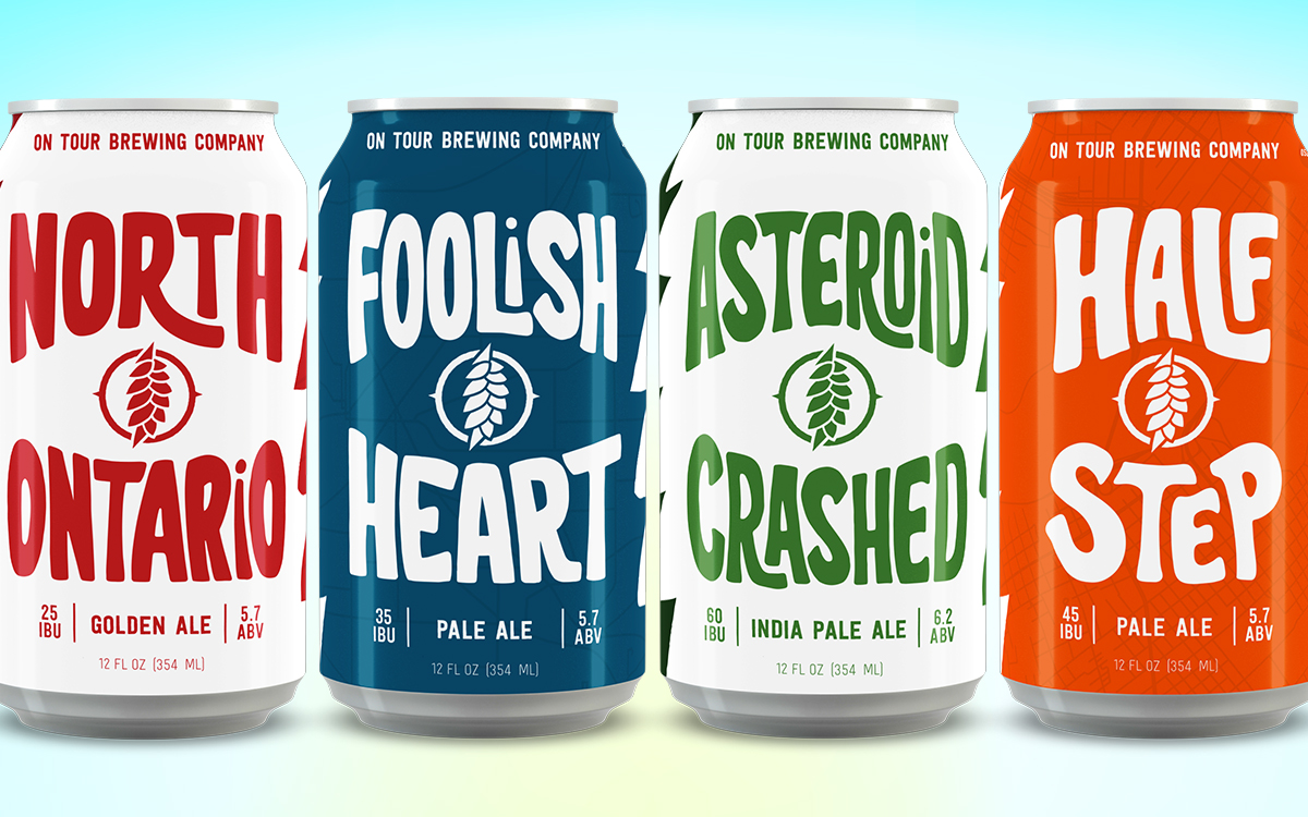
I created a series of custom beer can designs featuring hand-drawn typography and a cohesive packaging system that helped establish a recognizable shelf presence while giving each beer its own distinct personality. Hidden within the map-inspired backgrounds of each can is a unique Easter egg for music fans to discover and decode, creating an additional layer of storytelling throughout the lineup.
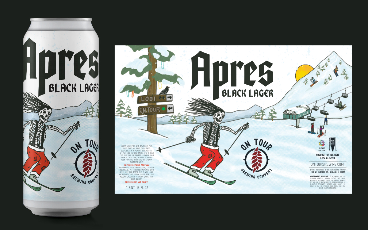
In addition to the can series, I designed specialty bottle labels for the brewery’s limited-releases.